
SoundCloud App Redesign
Redesigning SoundCloud in 5-days.
I was contacted by the design team at SoundCloud to propose a redesign of their iOS app. The team wanted a brand new fresh perspective and approach. I had 5 days to complete the project and pitch my proposal.
Design planning
To accomplish this design sprint, I had to set myself deadlines. Here is the methodology and structure I used for the 5 days.
Day 1/5 — Research/Observe
1.1 Generate information architecture benchmarks
1.2 Collect insights
Main sources of insights included: SoundCloud iOS Forum, articles from former SoundCloud designer, existing case studies, friends feedback, user test sessions with new users, app Store reviews

1.3 Send a qualitative survey

1.4. Write down ideas and prioritize
Day 2/5 — Define Problem
2.1 Define the main issues
2.2 Create Personas and Customer Experience


2.3 Audit the current version


Day 3/5 — Explore & Iterate
3.1 Find inspiration
3.2 Sketch out ideas
3.3 Create first components
3.4 Design Wireframes
Day 4/5 — The Solution
4.1 Create clear UX rules
4.2 Reveal macro-level changes
Current Navigation

Navigation Updates

New Navigation
4.3 Present final design

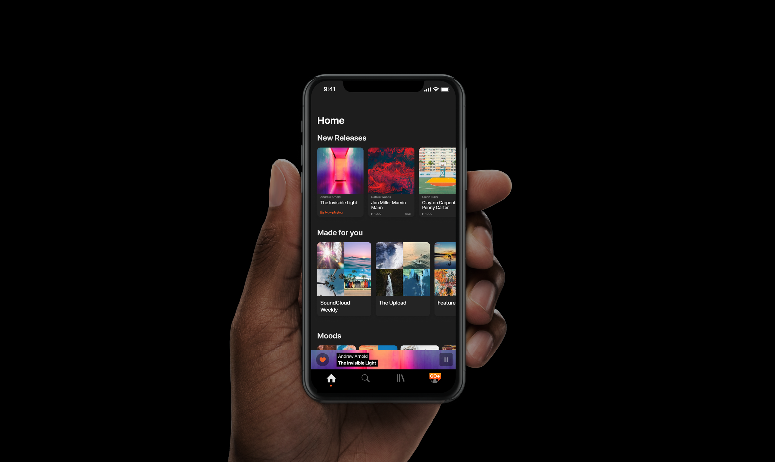
Home is what’s new
What’s new, what’s hot is only on the home page. That’s what SoundCloud is all about.

Search with ease
By empowering the user with suggestions, this new search page makes discovering content super easy.

Content, organized
Each content has a clear UI. Content is clearly sorted removing confusion.

Join the Pros
Understand the premium features in context.

Take Control
The player embraces the artboard colors, reveals clear touch zones to give back control.

A player with options
Easily add to a playlist, cast to a device or share with friends in a consistent experience.
Go Dark
Reveal your content with Dark Mode.
Figma Prototype
Enjoy the Figma interactive prototype below (recommend to open it full screen). To enjoy Dark Mode click on “Access my profile” from the GO+ tab in Figma.

Day 5/5 — Retrospective
5.1 Measure success
Using the prototype with new users and:

Generally speaking
👉 Measure the impact of the update on real users.
👉 Validate hypotheses and iterate.
Potential implementation
👉 A lot of technical constraints and screen states have been omitted considering the timing and would need to be reconsidered.
👉 Progressive rollout to beta users.
👉 Ask quantitative feedbacks to validate hypotheses and iterate.
5.2 Outcomes & lessons
Things I would do better next time:
(User tests) 👉 Perform additional user test sessions with existing users.
(Include branding analysis) 👉 Reflect SoundCloud values through the new concept.
(Include marketing/platform analysis) 👉 The business reality of the platform should be considered.
(Include font and icon) 👉 Include font and icon design in the analysis.
(Micro-interactions) 👉 Animate the most important micro-interactions.